Working for a Healthier Tennessee Logo Usage
Branding is important because it helps employees easily recognize that your wellness council communications are associated with Working for a Healthier Tennessee.
You may request our logo by emailing WFHT.TN@tn.gov.
Below are guidelines for using the Working for a Healthier Tennessee logo.

Primary logo use:
The full-color logo on a white background is the preferred usage.

Secondary logo use:
When the logo is placed on one of our two brand colors, Pantone 2757 or Pantone 1797, use the corresponding reversed logo.

Limited logo use:
The primary logo is always preferred. However, in cases where only a single color may be used on a non-branded background, use the corresponding reversed logo.

Minimum size:
To ensure the logo is always recognizable and legible, it should never appear smaller than .375 inches in height.

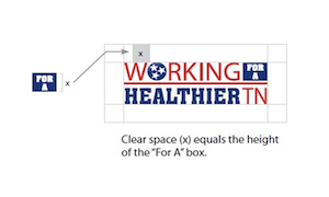
Clear space:
Maintain at least the minimum clear space at all times.